Friday, 14 January 2011

2. How Effective Is The Combination Of Your Main Product (Video) And Ancillary Texts (Digipak And Advertisement)?
Stills from Music Video


Digipak Stills


Advertisement Still

These are three stills from our final music video, my Digipak and my advertisement. In each of these, flowers are present and are in yellow. I got inspired to use the consistency of flowers and the colour yellow as a way of relating our final music video, to my Digipak, to my advertisement. I have used flowers all over my Digipak and advertisement to continue the floral theme.
Advertisement Still


In both of my Digipak and advertisement, I wanted to keep the style of writing very simple and conventional. I chose a font on Photoshop and used the same font throughout all of my ancillary products to stick to my genre, and the conventions of digipaks.
Final Advertisement

Digipak Front Cover

Stills From Music Video


I wanted the audience to have a clear visual link of the artist as she is new and we want the audience to remember her, so I decided that we should keep the hair, clothes and environment the same so that it is easier for the audience to recognise her. Her facial expression has not changes, her hair, make up and costume are the same which is a clear visual link. I chose to use the same image for my ancillary products as again, it is a clear visual link and helps he audience to recognise her.
How successful my main and ancillary products are and target audience
Thursday, 13 January 2011
Q4: What have you learned from your audience feedback? (Evaluation)
Our video on the big screen!
The audience in the cinema did seem to enjoy our video and applauded at the end.
Audience Feedback after Cinema Screening
Class feedback on my main product (VIDEO)

"The editing was good because it marked the pace of the song. However, the lip synching could be improved a little."
I agree that the lip synching was out sometimes and I have learnt that if the artist is seen singing a little off synch, this can make a huge impact to the overall video.
" The floral theme matches the summer mood of the song. However because of the sun, the lighting showed a few black shadows especially when the artist is seen singing on the red climbing frames"

We were unable to get the lighting the same at all times on that day of filming as the weather was breezy and some parts of the location were either really shady and some very sunny. I believe that is something to be careful of if making a music video.
The location and mise en scene fitted well with the codes and conventions of the genre. However, more locations could have been used".
We aimed to have a floral, realistic, 'normal day' feel to our video, which was why we mainly filmed in parks. Initially, we did plan to use different locations such as a riverside etc, but when filming, it made sense to keep it all one location but often change the costume of the artist to make it more engaging rather than the location.
Feedback on my ancillary products (DIGIPAK AND ADVERT)
My response to the feedback received about my main product and ancillary texts
Q3: How did you use media technologies in the construction and research, planning and evaluation stages? (Evaluation)
What technology did you use?
How did you use the technology?
FINAL CUT PRO


We used Final Cut Pro to create our music video. Here we were able to add effects, change the framing of shots and helped to put different shots into one whole production. We imported the video footage that we took for our music video. We done this by clicking on file, import, files and then chose the shots we wanted to import and edit in Final Cut Pro.

We were then able to add the shots onto a timeline along the page. We were able to cut the shots to make them shorter and place them together. We also added a few baselines that we laid on top of each other and cut out the parts in which we did not want or need.

Some of the shots that we had did not have a good framing. We were able to change the framing on Final Cut Pro by clicking on an icon above the shot we wanted to edit and by clicking on image and wireframe.

One of the effects we added was the slow motion effect. We went to
effects, video filters, then to video and selected the slow motion blur. We were also given an option box which enabled us to type in a number of how slow we acually want the footage to be.

Final Cut Pro was very useful for making our music video as it enabled us to see our shots on the side of the page, see our footage so far, the timeline and the shot we want to edit.

We made an anamatic on Final Cut Pro, which helped me to get a real idea of what the main product would look like once put together. When making the anamatic, we were mainly focusing on getting the three part shots on the three part beats as this was this most visible editing technique in our video. We used the scissor tool to cut out excess footage that we did not want or need.
PHOTOSHOP


I did not use Quarks Express to create my ancillary products. I created my digipak and advertisement both on Photoshop. I opened up a new page and started getting creative.
For my advert, I opened a new A4 sized blank page and cropped it in half as that is the normal size in which an advert is in a newspaper or magazine. I then chose the main colours of brown and yellow to match the floral theme. They are the colours one would assiociate with a sunflower, which links with my other products. I then added text consisting of relevant information and a flower on the side from the custom tool bar and also pressed shift and moved a still of the front panel of my digipak on the side of my advert.

For my digipak, I started by opening a four panel digipak template which I found on student, resources. I then decided what colour I wanted the main background to be. I already planned what the colour scheme would be throughout my products and decided a green background to relate to the greenery seen in the main video.


I wanted to make my digipak unique and I also wanted all four of my panels to match in some way so that they can be recognised easily as one product. I found some shapes on custom tools which I decided to use along my panels. I coloured the shape in a darker shade of green to make it visible.I was also able to change the size of the shape to my preference.

The layer tool at the side of the page on Photoshop helped me to see what I had on each panel and it helped me to remove anything I did not want by putting it in a small bin above.
SAFARI (Internet)

GOOGLE Images
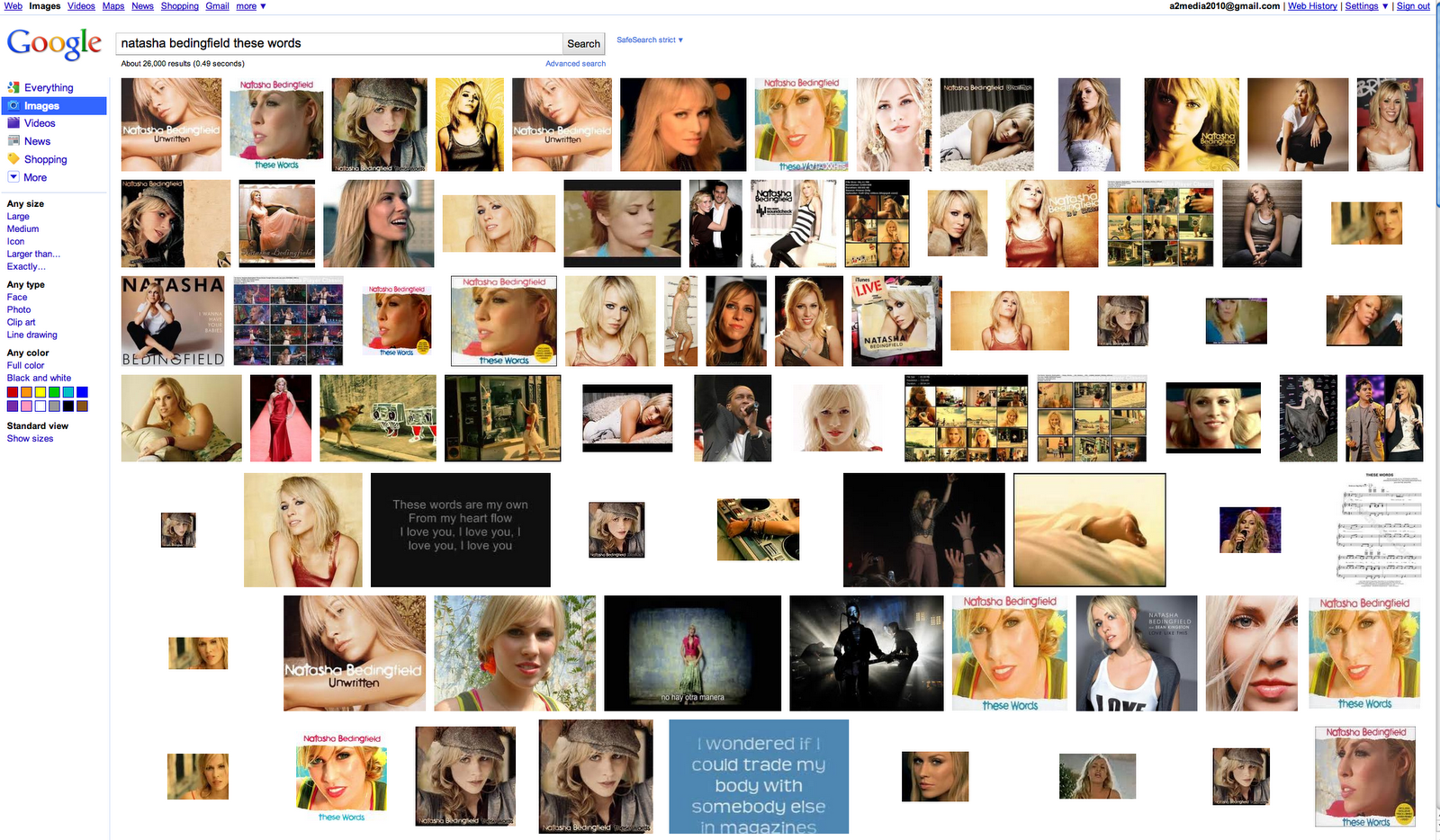
The main search engine I used was Google. I mainly went on google images to look at other album covers, digipaks and adverts. I also did some research via google i.e Natasha Bedingfield's original record label etc. I was often linked to Wikipedia where I continued my research. Wikipedia gave me information such as the genre if the artist, their record label, their albums and release dates and other relevant information related to the artist.


I was often on Youtube looking at Natasha Bedingfield's original video of 'These Words' and the other videos that influenced our main product. It helped me to get easy access to these videos and was fast and easy to use as I only had to type in the artist's name and song name and click search! I often did search for other British artists who are in a similar genre of Natasha Bedingfield to get a sense of the codes and conventions of that genre.
BLOGGER


I was constantly logging into Blogger and uploading my work to be up to date with my blogs. I pressed 'new post' and was able to add images, videos and text. I could also change the font, size and colour of my text and well as have a spelling check. Blogger also enabled me to embed videos from youtube.
Q2: How effective is the combination of your main product and ancillary texts. (Evaluation)
(Artist on my digipak)

(Artist in the video)


In the video, the artist is mainly seen having loose curley hair, so does she in the front picture on the digipak. This helps the audience to recognise the artist more easily. The artist is also seen always smiling and grinning which links with the theme and summer feel of the video.
(Digipak)


(Advertisement)

(Main Product- video)


The video has a floral theme, which is carried on throughout the digipak and the advertisement. There is a direct visual link between the products; they are suitable and most liley to attract the eyes of our young target audience.
(Colours present in the video)


(Colours used in my digipak)


(Colours present in my advertisement)

The digipak has a green background throughout, which matches with the outdoor background in the video of green grass and trees. In the digipak, there is also a sunflower theme. I used the main colours of brown, yellow and green, which I used in my advert too. My advert is mainly brown and yellow to link with the sunflowers used in the video and my digipak.
The font used throughout my ancillary products is called KATY BERRY

(Digipak)


(Advertisement)


I downloaded this font because it look quite similar to a youngs girl's handwriting. I did not use block capital letters, instead I used small case letters to connote a more feminine feel. The same font is used on my digipak and my advert to help them to link together and be similar.

I added the lyrics to the chorus of 'These Words' inside one of the panels of my digipak as this is conventional to our genre. A younger audience is more likely to want to sing along to the song.
How can your audience recognise your main product (video) and ancillary texts as linked products.
Subscribe to:
Posts (Atom)