Monday, 13 December 2010
Monday, 6 December 2010
Analysis Of Advert Relating To Pop
Theses are a few adverts of pop artist advertised on TV. I plan to use some of the features present such as reviews from magazines and newspapers, and how many stars was given for the song. I also plan to use an image that relates to the digipak so that the audience can see the link immediately if they wanted to buy the digipak.
Wednesday, 1 December 2010
Analysis of three adverts relating to our genre of pop (Research)
JLS - Outta This World - TV Ad
The television advert for their new album relates to the genre of some of the songs in their album.For example in the middle of the video, there are bright coloured electronic lights going across the members' bodies, this relates to the club theme for their song "' the club is alive". The album is very upbeat and funky. It sounds like the sort of music that every teenage girl would want to listen to. They are dressed in a stylish and suitable way, all complimenting each other. This can inspire children and is not like the outfits worn by hiphop artists. They do not have girls featuring in the video who are half naked or show expensive cars in the video and are not wearing a heavy load of jewellery. This helps to appeal to the teenege fanbase. Similarly, in our music video, the costume is very suited to the genre. We wanted to make our character quite inspiring to younger chidren. This dress sense suits the genre of pop and it makes tthe artists look innocent.
Justin Bieber has one of the biggest female fanbase in the world. He is young, attractive and talented, which is why msot girls tend to have a crush on him. His style is very casual and not over done. Justin Bieber has got the typical look of a pop artist. Our character in our music video has a typical look of a female pop artist too, attractive talented and stylish. The advert contains many bold letters and has his name is written in a larger font. The clothes he is wearing in the advert is very similar to the clothes the male character is wearing in our music video. It symbolises a normal and the 'right' way to dress for a pop artist or the ideal type of boy a female pop artist may go for.
The Wanted are a new pop boyband who have had a UK number one and other smash hits. They also fit into the genre of pop because people mainly associate pop with boybands. They are very modern artists and again look very normal and innocent. They relate to our music video in the way that they too target the younger female audience. They also are not over-rated and sing songs suitable for their audience.
Digipak Analysis Relating To Our Video
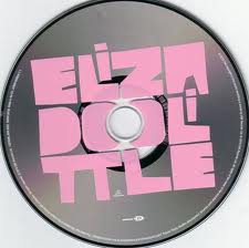
This is the front, back and CD cover of Eliza Doolittle. This cover is very conventional to the genre pop as it is very colourful. It includes pink, blue, orange, green, yellow and red. These colours are very playful and feminine which appeals to the target audience. This will relate to my Digipak as we plan to stay in the conventions of using colours such as yellow, green, orange and pink. Eliza is quite established, in which she does not use some of the conventions such as a close up of her looking at the camera. Whereas I plan to use a close up of our artist Emily Bloom as she is a new artist and I know that the audience will need to get to know her as this is very conventional. The back cover is also very conventional as she is present, and some of the colours continue to the back. She has many different types of fonts which is not as conventional, but it still works for the genre pop. As does the CD, which is plain, but very effective through the choice of font and colour.
This is the album cover of Marina and the Diamonds. There are many different ways to portray pop, and she does it in a more mature way. She still has the conventional close up of her face and a kind of floral background which reassures her femininity. Again, Marina is present in the back cover, it is a mid shot of her, but we still see all of her face. She has continued the continuity with the fonts, but not with the background. This is not quite as conventional as Eliza Doolittle's cover, but it is still very much pop. The CD, is quite plain, with the colours silver and black present, but they mach the front and back cover very well. I again plan to use a close up of our artist on the front cover, and use the same font through out my digipak as Marina and the Diamonds do.
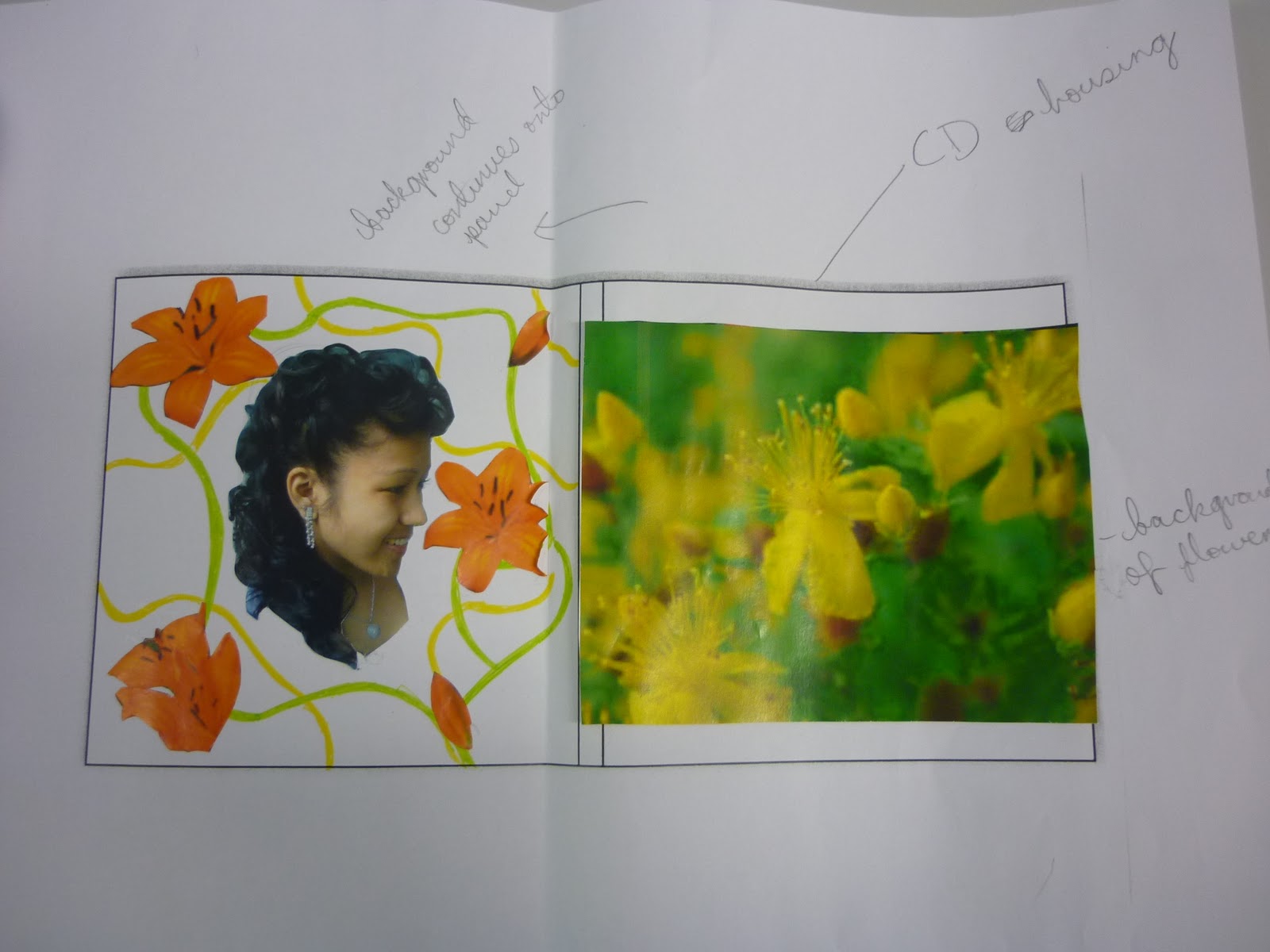
Ellie Goulding's album cover differs from the first two. She still fits into the category of pop as some of her songs are quite sweet. But it is mature pop and therefore her cover looks very plain, but still appeals to her target audience. I plain to have a plain CD in the middle of my digipak with just the artists name on it as Ellie Goulding does.
Analysis of three digipaks relating to our genre of pop (Research)
The colours used in the front cover are very bright and bold. This is a typical conevntion of a pop video because it looks attractive and targets younger children. Our music video is also colourful. The costume we used in our video is colourful;bright green and orange and hints of yellow. Most of these colours are shown in the fornt cover and help to attract the audience. The Saturdays target a young audience from around the ages of 10 and above, mainly girls. The music in the album is very upbeat and quity "cheesy" which is similar to most pop videos and our music video. We used a very "cheesy" concept of showing two individuals in love. In the sturdays' videos, they use many different colours to represent each memebr. Although this may seem very childish to an older audience for example over eighteen, the younger audience will be very interested. The saturday's are dressed shorts, skirts, tops and dresses. This dress sense does not reveal too much and also gives style ideas to their fans. Similarly, in our music video, the costume used was similar to that of the Saturdays and it was suitable for the audience. Both the characters in our music video and The Saturdays are not dressed in bikinies and standing next to men with big chains, They look innocent and pretty. There was not a proper digipak for this band and the others below becaus eit is not typical of a pop artist and album.
Miley cyrus is also known as Hannah Montana, who is a mega massive pop star. Her songs are mainly targeted to a younger, female audience starting from the young ages of 5-6. Similarly, Miley Cyrus produces music that is very similar to her pop genre. The picture of her in heh front cover is very pop-star looking. For example, it looks very similar to the front cover of Britney Spears album, with the stomach showing. This is
seen as a typical pop star pose. However Miley Cyrus targets a littleolder audience starting from the ages of 13 and above. This relates to our target audience for our video. Our video contains scenes of the characters kissing and hugging which is quite unsuitable for an audience younger than 14/13. In Miley Cyrus' videos, she is seen wearing much more reveling clothes than Hannah Montana and also songs that are written by herself and her father. These songs have strong meanings, so a much older audience would be more likely to understand the meaning of the song. This artist does not sing cheesy pop songs but has a similar target audience as our music video. The music in this album is mainly love songs which relates to our song.
JLS target a huge young teenage fanbase. This is our fanbase too. The music contains very younger audience to sing asimple lyrics which are quite "cheesy"- "My heart won't beat again". This relates to our music video's lyrics "I love you". The lyrics are supported with funky beats and music which the younger audience are more interested in. The simple lyrics also make it easier for the long to it.
Analysis of three advertisements that relate to your genre- must outline how they relate to your genre and audience
This advert relates to our genre as the audience of young girls, some may what to use the espacism of being a cartoon character and pretend to be someone else. This would make young girls be intrigued to go to Katy Perry's 'The California Dreams' to indulge themselves in fantasy and the notion of falling in a kind of fairytale love existence.
Beyonce's tour is to promote her current album. Her use of ellipsis (...) engages with our genre as we picked our sing to engage with young girls, which is in keeping with Beyonce adverting her audience to come and sing along at her tour.
Analysis of three digipaks that relate to your genre-must outline how they relate to your genre and audience (Research)
Amy Winehouse's digipak relates to my genre because she uses her emotions in crafting her music. As she her lyrics are all about love and the different aspects of being in love, for example, her declaration of how in love sh is with her boyfriend.This relates to the 'These Words' showing the our singer declaring her love fo her boyfriend. Also, the audience attracts the same demographic as our musc genre, young girls and teenagers as they feel that at these ages they can relate to the lyrics because it links their own personal changes.
Pixie Lott's digipak relates to the genre, Pop because it uses the convention of a face full picture of the artist on the front. Also, this connotes in with the thoughts that the majority of these songs are about Lott's personal life, especailly her love life. This is where our audience are similar because teenagers girls can connect with the revelance of her lyrics as they are living their lives.


The digipak of Kylie's 'Aphrodite' shows that Kylie has a mid shot of herself in the centre of the front cover and her arms are wide open. This connotes that her arms being wide open demonstrates she is ready to love again, as she is older than Pixie Lott and Amy Winehouse, therefore she has been through the emotional feeling of love as a teenager. However, Kylie shows that its not 'the end of the world' after your first love.
Subscribe to:
Posts (Atom)